
Speak art
director Martin Venezky and editor Dan Rolleri
Dan: Speak's design is often the subject of discussion regarding the magazine. Yet it is rarely talked about in relation to the editorial, but almost as an isolated entity. One of the pleasures I take from the process is seeing how you will interpret each article, yet aside from the Speak writers, I never find myself in conversation with anyone about the words and the layouts. Has your experience been similar, and what do you make of it?
Martin: Yes, I've had similar feedback in the past. I think that in our current culture, magazines that are heavily visual are not usually expected to have strong literary impact. I have to admit that I am guilty of buying magazines for their visual sensibility and never get around to reading them. It pleases me as much as I know it pleases you when a design fancier proudly admits to having read the magazine cover to cover. They are aware that that is an unusual feat.
Although
I do work hard to give articles, especially fiction and essays, a unique
and surprising interpretation. I also try to make the pages enticing from
a purely visual standpoint. So, if someone doesn't read an article—or
doesn't care to finish it—there is still something for them on the
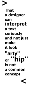
pages. That a designer can interpret a  text
seriously and not just make it look "arty" or "hip" is not a common concept.
In some circles, it would even be considered outrageous. I am lucky that
I don't have to fight for the right to do this, that it is actually expected
of me. I am curious what made you so open to this idea in the first place.
Dan: Before Speak, I bought certain magazines for their visual sensibility as well. But I also bought others to read. As my concept for Speak evolved, I thought a magazine that worked hard to excel editorially while not being constricted visually would be an unusual thing.
But it's frustrating when many people don't seem to get past the headlines and typefaces, and strangely are often critical of the design even though it's apparently the only reason they buy the magazine. On the other side there are lots of traditionalists who are convinced that to make something visually compelling only undermines and distracts from its content. I'm sure there are lots of people who appreciate the design and the editorial, but I too notice a certain pride when a reader points out that he or she appreciates both.
Let's talk about your approach to laying out Speak. It seems that in a given issue there are at least two methodologies going on. Sometimes you work very instinctively where you have the entire layout visualized within moments of reading the text. But other times you're more thoughtful, going through a series of options, refining again and again. Does the latter approach only become necessary when there isn't an initial burst of inspiration, or do you consciously work in different ways just to keep things interesting? Also, do you find that you're typically more satisfied with layouts that come from one method or the other? Do you sometimes look back at a something that came together quickly and wish you had spent more time on it?
Martin: First, I never really visualize how a page looks instantaneously. Typically, after reading the text, I'll let some time pass, then start rummaging through my collections of scrap, drawings, photos, etc., looking for something that connects to or resonates with the story. It has to really feel right before I take it any further. Often, immediately after reading the manuscript, a lot of potential metaphoric or suggestive images will come to mind. But, from experience, I always know that there is a good chance that these won't come off as well as I imagine they might. So I am always prepared to spend a lot of time on something that ultimately fails. Hopefully those ideas never make their way into print. But, I have to admit that many snuck in in the earlier issues especially.
Only recently have I been able to look back through all the issues and pull out my favorite pages. I find that now I am drawn to the quieter ones that hinge on a single thought or relationship of forms or objects. Some of the jumpier pages still excite me, but many feel like over-earnest attempts to be "radical" for its own sake. That isn't always a bad thing, it just doesn't always work in a magazine context.
I am always refining things to the last minute, and I am often very unsure of whether an idea should stay or be ditched. I like that feeling, though, because it suggests that I am trying new things. If I kept relying on surefire solutions, the project would probably bore me. I often surprise myself when images come together that I never expected to work. "The Plane" [Speak #10] or "Your Own Back Yard" [Speak #13] are good examples. I am especially pleased when I can take the same metaphor and make it work for two articles in the same issue, but in very different way. Using an orange for "Meditations on the Harp" and a few articles later for "Like Being Killed" [Speak #12] is a good example.
Dan: Your layouts for those articles are among my favorites too. In putting together a given issue, I'm always conscious of having things resonate editorially with each other. It's probably too subtle for the casual reader to catch, but it's helpful to have you visually emphasize certain connections. Of course you often discover new links between articles that I hadn't even considered, like with "Meditations" and "Like Being Killed."
Many people
might be surprised that you're more pleased with the quieter layouts.
There was a period, as the magazine evolv ed
editorially, that the design was downshifted to better suit the articles.
During this time we received lots of negative feedback, mostly from designers,
that the magazine had lost its spirit; that in producing stricter page
formats and more readable text, it had sold out. It seems there were many
designers for whom "being radical for its own sake" was a good thing.
Funny also that we were simultaneously picking up new, more literary-minded
readers who were probably more accustomed to the look of Harper's
and Utne. These people seemed to view the magazine's appearance
with suspicion and were often critical that the magazine was still too
radical, that headlines weren't where they were supposed to be, etc. It
was a period when I thought we were all doing our best work, yet we were
being criticized in a way we hadn't been before.
ed
editorially, that the design was downshifted to better suit the articles.
During this time we received lots of negative feedback, mostly from designers,
that the magazine had lost its spirit; that in producing stricter page
formats and more readable text, it had sold out. It seems there were many
designers for whom "being radical for its own sake" was a good thing.
Funny also that we were simultaneously picking up new, more literary-minded
readers who were probably more accustomed to the look of Harper's
and Utne. These people seemed to view the magazine's appearance
with suspicion and were often critical that the magazine was still too
radical, that headlines weren't where they were supposed to be, etc. It
was a period when I thought we were all doing our best work, yet we were
being criticized in a way we hadn't been before.
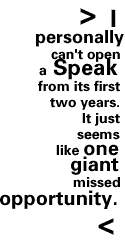
You say that you've only recently been able to look back through all the issues. Is this just because of a lack of time, or is it frustrating to look back at your older work? While I make light of it in our back-issue ads, I personally can't open a Speak from its first two years. It just seems like one giant missed opportunity.
Martin: I remember when you made the decision to tone back the design. I think I was, at least in my mind, kind of resistant, but now I think it forced me to consider my choices more carefully. And that has helped me in all of my design projects. This way, when something feels completely off-the-wall, it stands out with much more impact, like "End of the World.com" in the latest issue.
I've redefined what "radical" means to myself and to the students I teach. It can be as much about making a dramatic and daring interpretation as it had been about sort of "non sequitur" design. It doesn't have to mean messy at all. I am not an especially big fan of the new "super cold, super corporate" style of design that has hit the airwaves. It seems just as gratuitous as the "wild style" of the earlier nineties.
To me it's less a question of "selling out" as it is about discovering new territory and keeping myself challenged. When you find that you can put any picture with any article and claim meaning, it stops being challenging.
Up until now I would hand out copies of the magazine to prospective clients. And because the earlier issues had more things I didn't like than pages that I did, I avoided giving them away. But I recently decided to put together a "greatest hits" series of portfolios. In doing so, I could pull out the pages that I especially liked and found quite a few in the first few issues. Seeing everything together gives me a better sense of the breadth of the work I've put into the magazine.
I know how you feel about the earlier issues and, at the risk of turning this into a public pep talk, I think that you are too hard on yourself. You were creating something concrete out of a vision in your mind. There are bound to be missteps. But I completely understand how you feel. By maintaining a rigid self-critical stance it does make your work better. That is another thing I tell my students. They have to learn to be intensely self-critical. And regardless of how much work they put into an idea, they always have to be ready to accept the possibility that it just doesn't work.
I know there have been a lot of articles that you've worked hard editing that you ultimately had to give up on. That's a brave stance that too few people take.
Dan: It's self-serving enough to publish this conversation, but one more compliment and readers are going to be ill. On the issue of self-criticism, I must say that I am leery of consistently confident people. Not only do I find their self-satisfaction often unwarranted, I'm envious of their apparent well-adjustedness. At least in my case, my "rigid self-critical stance" is less a considered approach to my work, and more a psychological handicap. There are many days when I would rather be blissfully working in some dot-com marketing department, checking to see how I did on the weekend's office pool.
There was
a stage when you became critical of your own work, and you put your design
career on hold and went back to school. At the time did you know exactly
what you wanted to be doing, or was it just a matter of believing that
there must be more to design than the mundane stuff you were working on
at the time? 
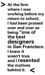
Martin: Ever since I was young, I have been skeptical of praise. I've found that it usually serves another purpose, and it rarely is to my benefit. At the firm where I was working before my return to school, I had been praised over and over as being "one of the best designers in San Francisco."
I knew it wasn't true, and I resented the motives behind it. My projects were very run-of-the-mill sales brochures for food companies, coupons, sell sheets, and point-of-purchase displays. I was neither proud of the work, nor felt that it made any difference in the world. Although I was making a reasonable salary, that was less important than being satisfied with the things I made. At the time, I had been seeing work by Rudy Vanderlans, Tom Bonauro, and others in the Bay Area. I thought it was wonderful, rich and emotional, and I knew I could do work like that, too. Over time, though, I found that the divide between what I was doing and what I wanted to do was enormous. To be a generator of work, and leader (rather than a follower of the trends of others), just wanting to do it was not enough. I needed to commit to my craft in a meaningful way. Therefore, I left work and studied at Cranbrook for two years.
To be honest, I had no idea what I was going to be doing, or where my work was really heading. At the time, I had no special interest in editorial design work.
It was funny when you approached me right after graduation in 1993. I was extremely skeptical of the project—something that Cranbrook can do to you. You probably remember my questions about the integrity of the project. They must have seemed horribly self-important and rude.
Dan: My first direct contact with you was in the form of that letter you sent from The Netherlands, when you were working at Studio Dumbar the summer after graduation. It's one of my great regrets that I didn't save it.
Here you were, just out of Cranbrook, being offered the art directorship at an internationally distributed magazine. And you write this extremely pretentious letter outlining what the magazine should be, what it shouldn't be, and implying that you would only be interested if it scored high enough on your integrity meter.
In the meantime, I was this moron who just wanted to publish a cool magazine. I thought, "who is this guy?" and immediately looked for P. Scott Makela's number. Still, I kept coming back to something Cranbrook's director Kathy McCoy said about you in her recommendation: that you were "without flaw." Between that and your letter, I imagined you to be some kind of super-genius designer. But, alas, you were merely a man, and your fancy talk was just a product of your fancy school.
It is funny that Speak eventually became, at least to some degree, the magazine you originally envisioned it to be in that letter. That's not to say the same evolution would have taken place if the magazine were wildly successful in its early frivolous days.
Finally, let's talk about the evolution of Speak's design. Sometimes I'm convinced the magazine needs to entirely rethink its visuals, yet your approach produces a sort of rethinking every issue. How restless do you feel with the look of the magazine? What's your thinking regarding a redesign?
Martin: One of the nice things about Speak, and our relationship is that I never feel restless about the design at all. As both of our interests change and develop, so does the magazine. I've generally been given the power to reevaluate my work all the time, and to decide that I want to be more "raucous" in one section and more "reserved" in another. In fact, I think that the shifting moods within each issue and over time have become one of the signatures of the magazine.
As far as I can tell, the only disadvantage is that I get so tied to all of the nuances and changes that I can't easily hand over parts of the magazine for others to design. There are only a few areas that are specifically formatted, and even those pages reconfigure themselves over time. As each issue begins, there is both the exhilaration of getting to try new things, and the anxiety of reinvention.
I suspect that the only way to redesign the magazine would be to codify and regulate larger areas of it. It is tricky to harness such a beast. Either it could channel its strengths for more power, or it could trap the thing so that it withers and dies.